How to draw a simple heart

Our first heart is the simple classic heart drawing. This is a simple straight lines version, often used as a heart icon, which makes for a perfect first heart shape to learn to draw.
How to draw a simple heart: step by step
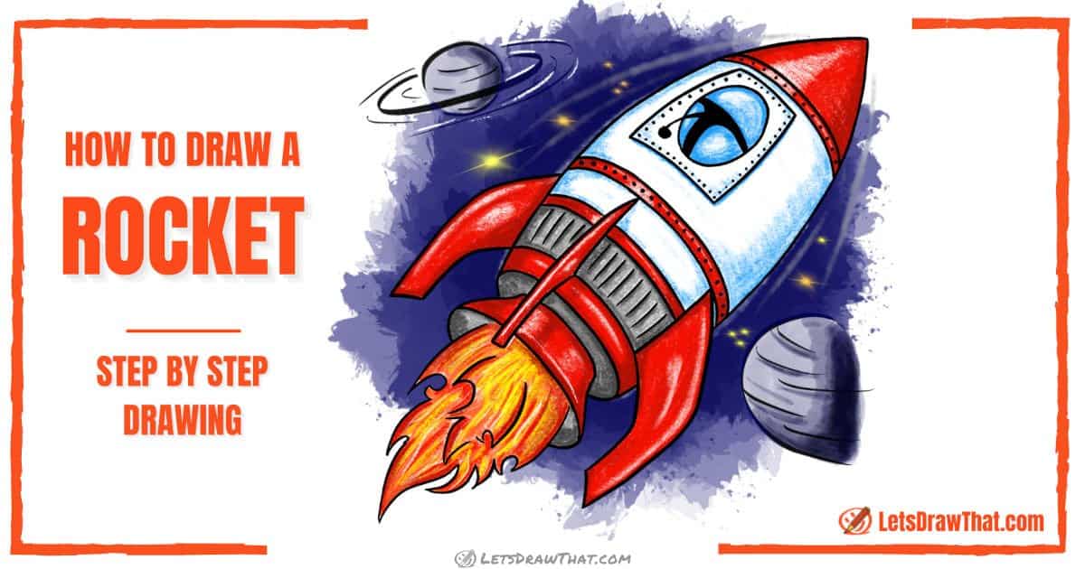
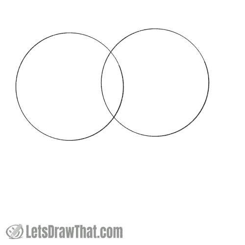
Step 1: Draw two circles

Start drawing the heart with two simple circles. Draw two circles of the same size, one next to the other, just touching.
Step 2: Draw a center line

Next, draw a single straight line down from the point where the two circles meet.
Depending on how long you draw the line, you can make your heart either tall or short. Here we are aiming for a heart that is about as tall as it is wide (kind of stuck with a square picture here, aren’t we?).
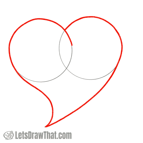
Step 3: Draw the tip of the heart

This is the step where our heart finally starts taking its shape.
Connect the bottom end of the centre line to the outer edge of each of the circles with a straight line, so that it looks kind of like an ice cream cone. That makes the pointed tip of the heart.
Step 4: Outline the heart shape
All that is left to draw the simple heart is to outline the correct parts of the heart sketch.
Trace the outer line from where the circles meet all the way down to the heart tip. Repeat on the other side!
How to draw a simple heart: completed drawing
How to draw a simple heart: finished outline drawing

Here is the finished simple heart drawing after we have erased the sketch lines that helped us construct the heart shape.
Wow, in just four steps you have learned how to draw a simple heart!
How to draw a simple heart: finished drawing coloured-in
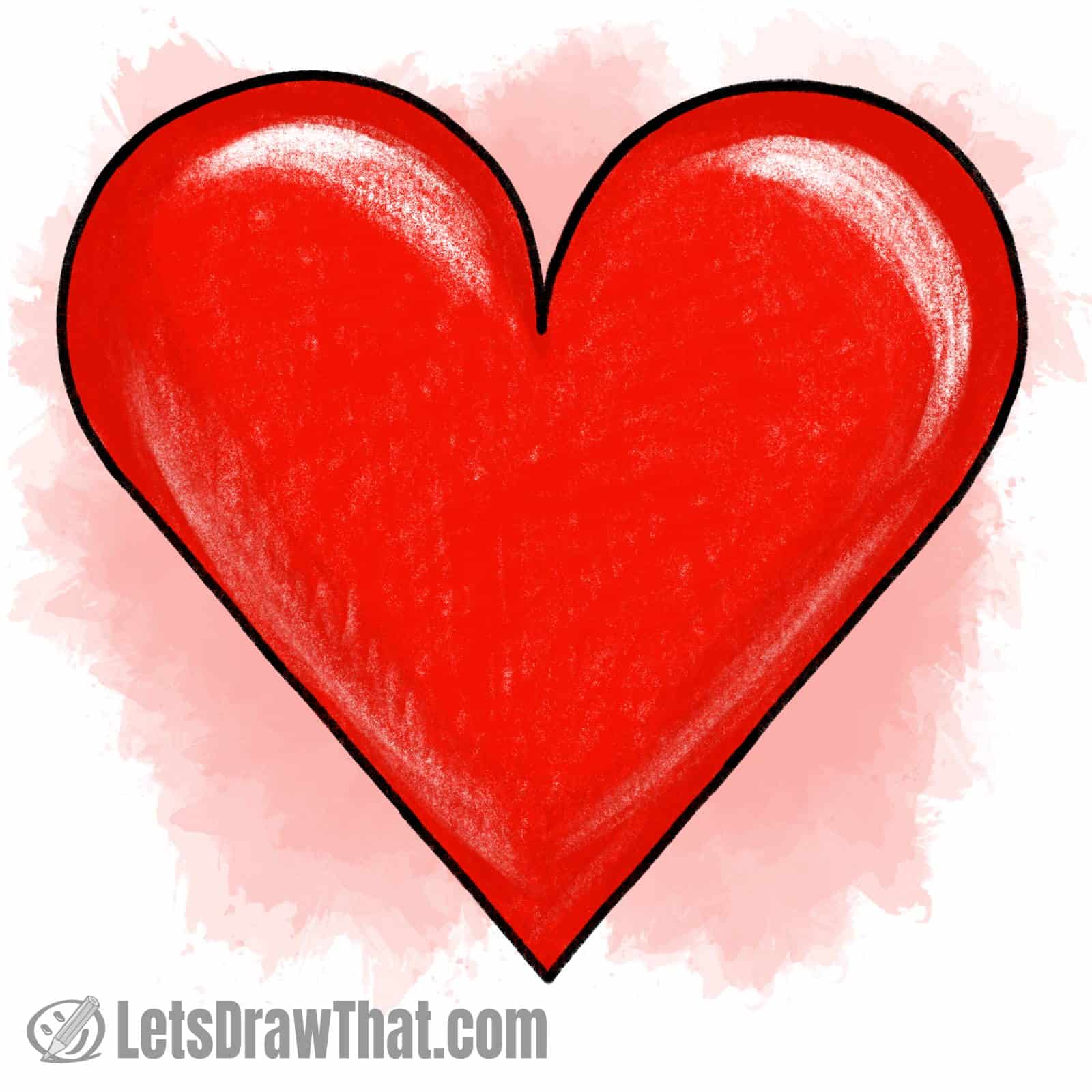
Even a simple heart drawing can get better if it is coloured in. Well, the traditional colour for a love heart is bright red – so that is what we have here.
To make the flat heart drawing look a bit more plastic and interesting, you can leave out some white highlights (or erase them) and add some darker red shading around the edges, as you see in our picture.
How to draw a heart – a nice curved heart

Here is another way how to draw a heart. We will just curve the pointed end of the heart a bit. Another simple trick is to slightly overlap the starting circles, to make the heart shape pop out to 3D. The result is a much nicer and more interesting heart drawing that is as simple and easy to draw as the one above.
How to draw a heart: step-by-step
Step 1: Draw two circles
Just like with the simple heart above, start by drawing two circles. This time though, draw them overlapping a bit instead of just touching.
Step 2: Draw the heart tip side lines

Because our heart is asymmetrical, we don’t need to draw the centreline as we did for the simple heart. Instead, we can draw the curved tip side lines straight away.
The right line is a long, simple curve. The left side is a shorter dented sort of “S” curve. The result, unlike our previous ice cream cone, is a nice curved heart.
Step 3: Draw the heart outline
The outline is also slightly different to our simple heart drawing.
Trace the left side of the heart first. Start about halfway up on the inner part of the circle and transition smoothly following the sketch from the circle to the bottom pointy curve.
The right line starts on the left outline, which gives the feeling that the right part of the heart is hiding behind the left half. That gives our heart some volume, so it isn’t looking as flat on the page as the previous simple heart.
Like the other side, transition the top circle smoothly into the bottom curve, all the way to the pointed tip to complete the heart outline.

How to draw a heart: finished drawing
How to draw a heart: finished outline drawing

Erase all the guidelines that you don’t need anymore to see the nice shape of your second heart.
Wow, we have beaten our own record on how to draw a heart – this one took just three steps and it even looks better!
How to draw a heart: finished drawing coloured-in

As usual, our last step is colouring in the heart. As you can see, we are using the same trick as on our simple heart to leave out some highlights and add shadows to really make our drawing pop out.
We’ve also added some curved lines on the top and bottom of the heart, to make it look like it is a living and beating heart.
Heart drawings for Valentine's day
OK, now that you know how to draw a heart, let’s give you inspiration for some bonus heart drawings. The following drawings would be perfect for some lovely Valentine’s day heart drawings, or even for mother’s day cards. These simply combine the heart with parts from other tutorials on this website to make another interesting love heart drawing.
Heart drawings for Valentine's day
How to draw a heart with a banner

The first popular combination is to draw a heart with a banner across it. Simply use the wavy banner from our “how to draw a banner” tutorial to add your short message across the love heart.
Play with different placements, but running the banner across the heart slightly at an angle seems to work the best, as it nicely matches the shape of the curved love heart skewed to the side.
Draw a flying heart with wings - Love is in the air!

When love is in the air, then the hearts can fly high!
Well, this flying heart takes its wings from the parrot in our “how to draw a bird” tutorial. Just pick up the parts from that tutorial to draw a lovely pair of wings for your Valentine’s heart drawing. The lettering is optional.
(No birds were harmed in the making of this drawing.)